The problem
Most software is designed for a demo. It looks convincing with three tidy rows of sample data and falls apart with four hundred messy real ones. Nobody designed what happens when a field is empty, when the connection drops, or when a name is long enough to wrap.
The result is software that staff resent and quietly work around, usually by going back to a spreadsheet.
What we design instead
We start with the job, not the screen. Who uses this, what are they trying to finish, what is in their way, and what does the mess actually look like at volume.
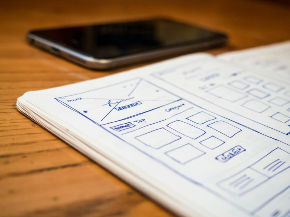
Then wireframes, so we argue about structure while it is still cheap to change. Then visual design for every screen and every state, including the unglamorous ones. Then a design system so the tenth screen costs a fraction of the first.
How we work
- Research. Interviews with the people who will use it, plus a look at what they do today, including the workarounds.
- Flows and wireframes. Structure agreed before anyone picks a colour.
- Visual design. Full design against real content and real data volumes.
- Prototype and test. A clickable build, put in front of real users, before development starts.
- Handover. Components, tokens, specifications and a walkthrough with the developers.
Design systems, not one off screens
If your product will live more than a year, a documented system saves more than it costs. One set of components, one set of tokens, one place to change a colour. It also makes it far harder for the product to drift as new people join.
Who this is for
Teams building a product, replacing an internal system, or rescuing software that users avoid. Also teams with developers but no designer, who need a system their engineers can build against.
Designing for the mess
Most software is designed for the demo. Three tidy rows of sample data, short names, no missing fields. Then it meets four hundred real records with inconsistent formatting, names long enough to wrap, and half the optional fields empty.
We design against your actual data, including the awkward parts. A table that looks elegant with five rows and collapses at five hundred has not been designed, it has been decorated.
The states nobody designs
Empty, loading, error, partial, offline, permission denied and success. These are the difference between software that feels finished and software that feels like a prototype, and they are almost always left to whichever developer reaches them last on a Friday.
We design each one, with the actual copy. Error messages say what happened and how to fix it, without apologising.
Research, even on a small budget
Where budget is tight we run a shorter version rather than skipping it. Even three interviews and an hour watching someone do the job today will change what gets built.
The most expensive thing in any project is building the wrong thing well, and that decision is usually made in the first fortnight.
Design systems
A documented system pays for itself once a product lives beyond a year or a team beyond one designer. One set of components, one spacing scale, one place to change a colour.
It also slows drift. Without it, every new screen is slightly different and after eighteen months the product looks like four products stitched together.
We deliver tokens and components in a form engineers can consume directly rather than a static specification they have to interpret.
Accessibility as a design decision
Contrast, target size, focus order and label clarity are design decisions, not engineering ones. Deciding them at design time costs nothing. Discovering them in an audit after launch costs a redesign.
We design to WCAG 2.1 AA and mark the decisions in the handover so they survive implementation.
Working with your developers
If your own team is building, the handover is the deliverable and we treat it as such. Tokens, spacing, breakpoints, interaction specifications and the reasoning behind the awkward decisions.
We stay available during the build for the questions that always arise, because a design handed over and never discussed gets reinterpreted.